
Hyperpop art is a visual extension of the hyperpop music movement, blending surreal, neon-infused, and chaotic aesthetics with internet culture. This art style is characterized by maximalist compositions, distorted typography, and exaggerated digital effects, pushing the boundaries of conventional digital design. As artists embrace vibrant colors, glitch elements, and futuristic themes, hyperpop art is redefining digital aesthetics in a bold and unconventional way.
The Origins of Hyperpop Art
Hyperpop art evolved alongside the hyperpop music genre, which gained traction in the late 2010s. Influenced by artists like SOPHIE, 100 gecs, and A.G. Cook, the visual aesthetic emerged from the same ethos—embracing digital distortion, synthetic textures, and an almost chaotic composition. The movement draws inspiration from internet culture, early 2000s web design, vaporwave, and anime-inspired visuals, blending them into a hyper-saturated experience.
The roots of hyperpop art can be traced back to other digital art movements like vaporwave, cyberpunk, and glitch aesthetics, all of which share a love for bright neon palettes, futuristic imagery, and elements of nostalgia mixed with technological surrealism. Unlike minimalistic and clean graphic design styles, hyperpop art thrives on sensory overload, making it a perfect companion to the hyperactive, high-energy nature of hyperpop music.
The Role of Maximalism in Hyperpop Art
Unlike traditional minimalist design trends, hyperpop images thrive on excess. Maximalism in this art form is defined by overlapping elements, bright neon colors, and exaggerated typography. The goal is to create an overstimulating effect that mirrors the hyperactive nature of internet culture. This chaotic yet structured approach gives hyperpop art a distinctive look that stands out in digital spaces.
Maximalism is not just about visual excess but also about a mindset—embracing digital clutter, randomness, and a break from traditional design rules. While minimalist design relies on white space and clarity, hyperpop art throws these conventions aside in favor of layering, overlapping, and bold contrast. The design principles often involve heavy saturation, excessive text usage, and clashing color schemes that challenge conventional aesthetics.
The Influence of Glitch Aesthetics
Glitch art plays a crucial role in hyperpop aesthetics. Artists intentionally use pixelation, distortions, and 3D-rendered imperfections to create a sense of digital decay. This technique reflects themes of technology’s imperfection and the beauty found in digital errors. By incorporating glitch effects, hyperpop art conveys a sense of rebellion against traditional, polished digital design.
Glitch aesthetics are often achieved through software manipulation, where designers intentionally introduce errors, pixelation, and frame distortions. This technique serves both as a stylistic choice and as a symbolic nod to the way digital media is imperfect and constantly evolving. The inclusion of glitches in hyperpop art embodies the idea that technology is not always perfect—errors and distortions can be an artistic statement rather than a flaw.
Bright Neon Palettes and Color Psychology
Color is one of the defining aspects of hyperpop art. It relies on electric blues, hot pinks, neon greens, and highly saturated gradients to create an eye-catching visual experience. These colors evoke energy, excitement, and artificiality—perfectly aligning with hyperpop’s futuristic and cyberpunk-inspired aesthetics. The strategic use of high-contrast color combinations helps create a sense of movement and intensity in static visuals.
Neon colors are often associated with digital culture, nightlife, and futuristic settings. Hyperpop art takes this to an extreme, creating highly immersive visual compositions that demand attention. The combination of extreme contrast and vibrancy enhances the chaotic nature of the genre, making each piece feel alive and energetic. This intense color usage aligns with hyperpop music’s fast-paced, eclectic sound, creating a cohesive experience across audio and visual mediums.
Typography as a Design Element
Hyperpop typography is unconventional and often distorted, stretched, or layered to create a dynamic visual effect. Fonts in hyperpop art may mimic early internet aesthetics, with pixelated text or bold, oversized lettering that appears almost chaotic. Typography is treated as an artistic element rather than a simple method of conveying information, enhancing the surreal nature of hyperpop visuals.
Many hyperpop-inspired visuals use 3D text, glitchy animations, and exaggerated font distortions to add movement and energy to static designs. It’s not uncommon to see typography that looks intentionally warped, fragmented, or layered in a way that makes it visually overwhelming but still readable. This experimental approach to typography aligns with hyperpop’s rejection of traditional design norms and encourages creative freedom.
The Impact of Hyperpop Art on Digital Culture
Hyperpop aesthetics have extended beyond album covers and music videos into broader digital spaces, including fashion, graphic design, and social media branding. The movement has inspired new approaches to digital art, influencing content creators, meme culture, and interactive web design. Brands that cater to younger audiences have begun adopting hyperpop-inspired visuals to connect with the internet-savvy generation.
Social media platforms like Instagram, TikTok, and Twitter have become breeding grounds for hyperpop aesthetics, with digital artists creating vibrant, over-the-top visuals that align with the fast-paced, attention-grabbing nature of online content. Many brands targeting Gen Z consumers have embraced hyperpop design elements in advertising and product packaging, recognizing its appeal as a modern and rebellious visual language.
How to Create Hyperpop Art
For those interested in experimenting with hyperpop aesthetics, several design techniques can be used:
- Layering & Overlapping: Stack multiple elements to create a sense of depth and movement. Hyperpop art often involves a mix of 2D and 3D elements, as well as multiple layers of images, text, and effects.
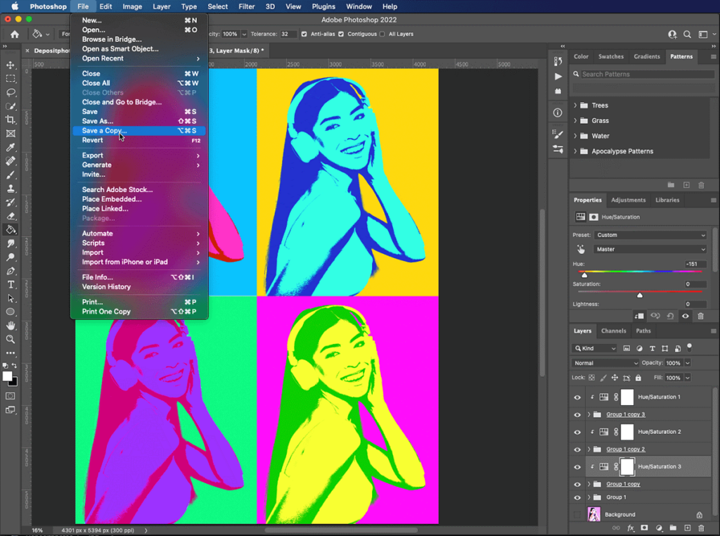
- Glitch & Distortion Effects: Use software like Photoshop, After Effects, or online glitch generators to add digital imperfections. Artists often use databinding techniques to introduce distortion into images, making them appear corrupted or fragmented.
- Neon Color Schemes: Work with highly saturated, futuristic color palettes. Many hyperpop designs use gradients, holographic effects, and RGB separation to achieve a glowing, otherworldly look.
- 3D Elements: Incorporate 3D-rendered objects and metallic textures to create a cyber-digital feel. Blender, Cinema 4D, and other 3D modelling software can be used to generate abstract shapes, floating objects, or even text with metallic reflections.
- Dynamic Typography: Experiment with stretched, warped, or chaotic text layouts. Fonts with a futuristic, distorted, or pixelated appearance work best for hyperpop aesthetics. Text can be animated, deformed, or given depth using software like Adobe After Effects or Cinema 4D.
- Collage & Mixed Media: Combine photography, digital painting, and 3D renders to create a unique, layered composition. Hyperpop art is known for its chaotic yet intentional structure, so don’t be afraid to mix different styles and mediums.
- Motion Effects: Adding subtle animation, even to static visuals, can enhance the hyperpop aesthetic. GIFs, looping animations, and video effects can make hyperpop art even more dynamic and immersive.
Conclusion
Hyperpop art is a groundbreaking aesthetic that challenges traditional digital design principles by embracing excess, glitch effects, and hyper-saturated colors. As internet culture continues to evolve, hyperpop visuals are likely to play a significant role in shaping future design trends. Whether in music promotion, fashion, or branding, the influence of hyperpop aesthetics is undeniable, offering a fresh and rebellious approach to digital expression.